AptFinder
Website and mobile app designed to simplify long-term apartment search. Focused on usability, clarity, and a smooth browsing experience from search to scheduling.
Year
2024
Client
Portfolio project


Sector
Real Estate / Housing Tech
Challenge
Design a user-friendly mobile interface that simplifies the search and booking process for long-term apartment rentals.
My Role
UI/UX design and branding: responsible for user flows, wireframes, visual design, design library and interactive prototypes.
Project Time
4 weeks (concept to high-fidelity design)


Competitive analysis
I’ve analyzed a few existing platforms in the US market (Zillow) and in Spain (Idealista, Fotocasa) to see what worked and what didn’t for an average user. I’ve also compared to platforms like Airbnb from a related, but different sector of short-term rentals.
From a series of mini surveys I’ve found out that the main challenges that the users are facing when looking either to buy or rent an apartment long term are:
Overwhelming Amount of Information
Unclear or Incomplete Listing Details
Poor Search and Filter Experience
Frustrating Communication & Booking Flows
Trust & Credibility Concerns
Lack of Personalization
Cluttered or Unintuitive Interfaces
Many users struggle with finding relevant, trustworthy listings efficiently, especially on mobile. The challenge was to design a clean, intuitive interface that simplifies search, enhances listing clarity, and supports easy decision-making.
User flow & task mapping
To design a smooth and intuitive experience for apartment seekers, I began by mapping out key user goals and actions within the app. For that I’ve used a primary user persona: Anna, 29, remote worker relocating to a new city. I’ve mapped key actions from the sign-in screen to the point of contact with a property owner. This task flow focused on the primary user journey: discovering listings, refining search criteria, evaluating property details, and reaching out.
Creating this flow helped me identify key decision points (e.g., “Do I like this listing?”), potential friction (like repetitive filtering), and where to introduce helpful UI patterns, such as saved searches, or listing previews.
By visualizing the steps and decisions involved, I ensured that the UI design would support a clear, guided path, especially for users navigating dense information on mobile. This process also laid the foundation for designing reusable components and interactive prototypes later on.
Brand design & style library
The visual design was crafted to reduce cognitive load and help users focus on what matters most: supporting users in navigating complex housing decisions with clarity and ease. To reduce visual noise and make key content more accessible, the interface relies on a minimal, structured layout, a soft neutral base, and clearly defined visual hierarchy.
The color system combines cool neutrals with carefully selected brand and action colors, supporting both accessibility and making it easier to find your way through the app. Typography is set in Gotham Rounded, a friendly yet modern typeface that balances readability with a sense of approachability.
The style library includes a comprehensive set of reusable components, interactive states, and iconography tailored to the app’s core functions. These elements support design consistency and scalability, while also ensuring an intuitive experience across devices.
The AptFinder logo is a simple, geometric home mark. It is designed for clarity and flexibility, maintaining recognizability from full brand lockup to icon scale.
Overall, the visual system strengthens the brand while helping users stay focused, navigate with confidence, and engage more easily with key features.
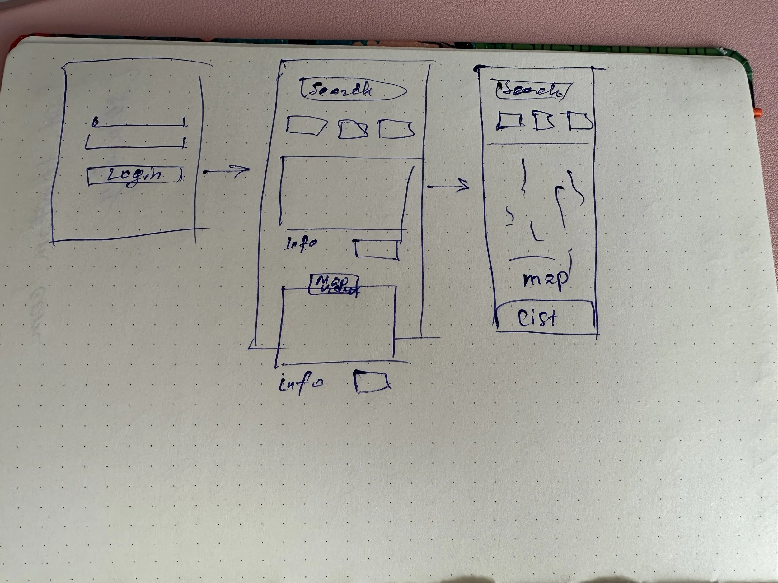
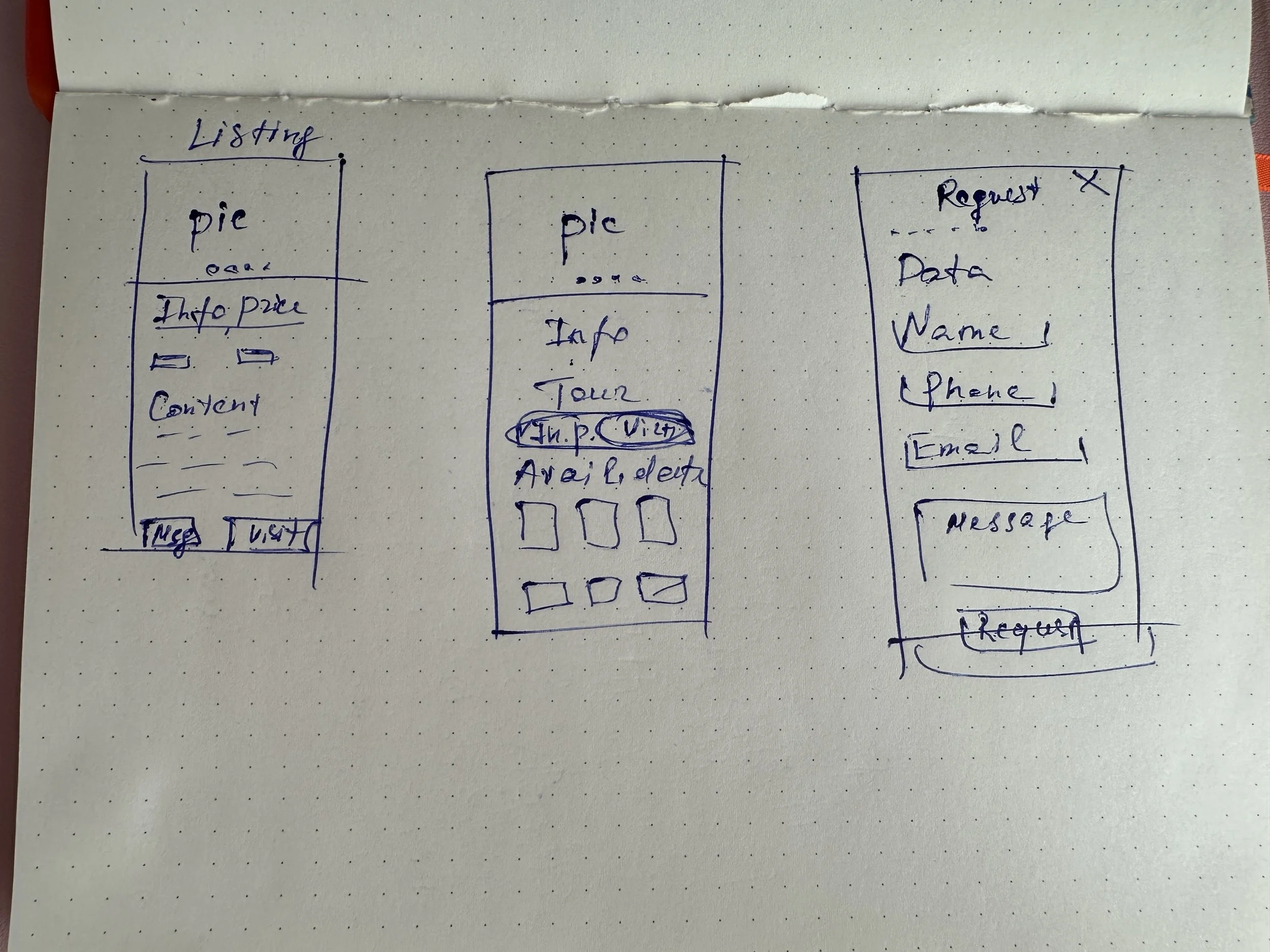
Low fidelity wireframes
After establishing the visual language and user flows, I created low-fidelity wireframes to map out content hierarchy, screen structure, and key interactions. These helped validate core user journeys like search, listing comparison, map view and contacting owners before investing more time in high-fidelity visuals.
The goal was to keep navigation intuitive and minimize cognitive load, especially in screens where users compare multiple listings or refine detailed filters.
High fidelity mockups and prototype
For the high-fidelity mockups and prototype of the AptFinder, I began with a mobile-first approach to prioritize accessibility and usability on smaller screens, where most users start their search. Once the mobile flows were solidified, I adapted the design for desktop, adjusting layout and spacing to support more detailed content and side-by-side comparisons. One of the key challenges was finding the right balance between a clean, modern UI and the amount of information long-term housing searches typically require. To address this, I drew inspiration from familiar, user-friendly platforms like Airbnb, integrating elements such as card-based listings, and responsive map previews. This approach helped streamline navigation and reduce cognitive load, creating a more focused, comfortable experience for users browsing long-term apartment options.


In the end, each step of my process was built on user insights, ensuring the final product supported decision-making without adding complexity. The result is a framework that can grow with new features while keeping the experience straightforward and intuitive.